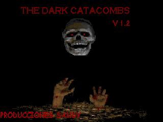
This mod is roughly nine years old now, and I'm pretty sure I didn't play it when it came out, but something about it rang familiar for me, just by seeing the title screen and hearing the name. Then I remembered, this mod came out almost immediately after Halls of Stonehenge was released, and was one of the first mods to use the sprites I had taken from Blood to be used in HOS. Another game that was very popular at the time this was released was Spear Resurrection (we didn't have End of Destiny yet then), and there is a heaping helping of graphics borrowed from that mod as well. Well, lots of modders borrow (hopefully with permission) sprites from their fellow modders from time to time, the big question is, how well do they work in the mod they're being transplanted to?
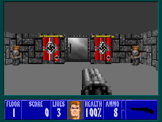
Well, in my opinion, they don't, and I'll explain why in just a sec. But first, I'd like to point out something about this mod - the graphics from HOS were borrowed without permission. HOS was designed in such a way upon release that the sprites, maps, etc wouldn't be accessible with the editors of the time, so to get around this, the author of DC, Sandy, used a combination of sprites he cut from screenshots of HOS, and images taken from the GIF files at the HOS online manual. The sad thing is, I'd probably have given permission to use the ones featured in this mod if he'd asked me, but as it is, the end results look...crappy. The enemies in the mod only use the front facing frames, and for some reason, Sandy tried to hand-draw slightly different death frames that look even worse than the already weird looking other animation frames.
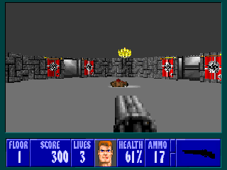
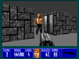
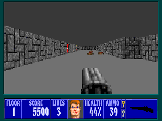
As you can see from those first couple screen shots, while most of the sprites came from HOS (enemies, treasures, health, keys) most of the walls were taken from Spear Resurrection, with a few taken from vanilla Wolf near the end of the mod. Now herein lies the problem - the wall textures in SR were brilliantly and meticulously done, and even from a distance (before SDL) looked great in the original mod. On the other hand, the sprites taken from Blood for HOS were massively reduced in size, and developed kind of a muddy, dull look to them, that only really worked in a mod where everything had that same look to it. When you look at HOS sprites next to SR walls, though, the sprites stand out like a turd in a punch bowl, and don't fit together well at all.
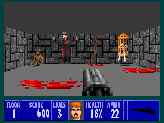
Now once again, lots of modders, myself included, have borrowed work from multiple different mods and used it to contribute to a new mod, but I don't think I'm being unfair when I say this combination just really doesn't work. There were a few odd vanilla wolf sprites used here and there in later levels, and one, maybe two decorative sprites that may or may not have been done by Sandy. If you look at the screenshot above, you'll see what looks like a Nazi that I'm guessing is supposed to be cuffed to the wall behind him, and he appears giant next to the borrowed sprites next to him, only it looks like he's floating with his arms outstretched instead. And why are Nazis killing Nazis anyway? Don't know, there's no story included with the mod...
And that brings me to talking about something other than the graphics now (thank goodness, right?) You're wondering how everything else is? Well, the title screen looked promising, but it was also sort of the high point of the mod. The music remains unchanged throughout. The mapping was a letdown as each map featured large rooms and long winding hallways with only the occasional enemy or object sprite thrown in here or there. While different walls were used from level to level, only one wall type was used in each level, and that gets boring fast (yes, I did it myself with some of my early mods, but I know better now). There was no creative use of floor codes, keys were always sitting out in the open just a little ways from their respective locked door and no map took me longer than 2 to 3 minutes to complete, for which I was infinitely thankful.
I can't recommend this mod to anyone personally. It lacked challenge, it lacked atmosphere, and worst of all, it lacked any semblence of fun. If nothing else, though, it serves as proof that it takes more than a bunch of sprites from popular mods to make a playable new mod
I made this mod ages ago. I was a kid then and didn't speak English at the time. Sorry if I offended someone with this mod.
ReplyDeleteNo offense taken, I didn't know you were a kid when you made it, I can understand some of the developmental oversights in light of that!
ReplyDelete