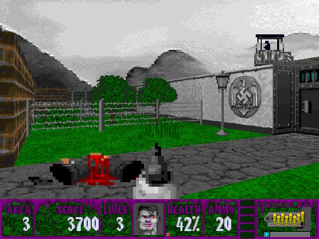
I have had a couple of times, especially in the first year that I started mapping, that I looked back at some of the levels that I made and realized that they didn't hold up as well as I thought they would. Letting some time pass by is usually a good means to be able to take a more objective look at your own work (as objective as humanly possible, of course). As was mentioned in the post on level 1, this was the first advanced mod I worked on. As such, your inexperience is bound to show through at times. And it did with the old version of level 3, which lacked everything that makes the current version of level 3 one of my favorites. It was relatively plain, with no different floor/ceiling textures within one room. It mostly featured corridors within the prison instead of the big, open areas it contains now. The old version was, all in all, the work of a newcomer.
Part of my mapping skills improving was because of experience, but next to that, it was also Dean joining the project that improved my mapping. I remember being in awe when I saw the first map he made. He used floor/ceiling textures in such an interesting way, combining them with wall textures to give rooms an entirely new feel. He really used them in a way that I hadn't considered before, and this in turn led to me using the textures in a more interesting way. Next to that, his enemy placement was always suprising and challenging, compared to my relatively straightforward usage of enemies. It was a new level of mapping, in my eyes.
Before this project I did all my mapping alone, but this project really opened my eyes to the benefits of being able to bounce off ideas with a mapping partner. It was stimulating to work with someone who is so great at mapping that it makes you want to improve your own skills. That still is the case. But Eisenfaust Origins is really the project where I made the big leap in terms of aesthetics and creating a world within the levels.
Level 3 is part of the 'Prison' section of the levels, though one might be inclined to say that the whole mod is basically a giant prison, seeing that it takes place in a camp. But we had decided to divide the game into different sections ala Spear of Destiny. So we had a 'Prison' section, a lab section, an execution section, etc. This level clearly reflects its section, while at the same time introducing new things like the big open area where the mutants are working. It's a new side to the prison theme.
But apart from that, I'm quite happy with the way this level turned out. At this point I had rarely done these kinds of big areas, which was the biggest challenge for me. This level is one of those that started from a vision, not a particular gameplay motif. I wanted to see a working section, where prisoners were working on the field. Next to that, I wanted some sort of entrance with gates that were guarded by SS (or their replacements at least, but I still refer to them as their Wolf3D counterparts). That's basically where the idea for the map started, just to see those things in this engine.
It's a change of pace from how I map nowadays. Usually I start with a gameplay idea, meaning that I take a feature and use it in a way I perceive it to be challenging to the player. For instance, in the Christmas pack of Eisenfaust origins there is a level where the player has relatively little ammo, and is facing off against some of the rocket guards. The trick is to get them to blow themselves up, because you just have too little ammo to take them out with a gun. That's the sort of manipulation of the gameplay elements that I'm fond of doing nowadays. But earlier I really just worked from situations/visions; environments I wanted to create. Perhaps a bit pretentious to say, but my old approach was more that of a movie director than of a level designer.
You can download Operation: Eisenfaust Origins HERE.
You can watch Balames' playthrough of level 3 below;


No comments:
Post a Comment